UX audit.io

The ‘WOW’ Factor in UX Design

How to give your management team the wow factor they are seeking for


- Kirit Lakhani, UX Lead @ Zycus Inc.
8th December 2017

What should be the outcome of a design? Is it something so spectacular that will make the product owners awestruck? What exactly do we think is the role of design? Is it to impress, seduce or amaze the CEO, VP or the product managers? Are we approaching design with the right attitude?
WOW gif

Source: tenor

A few months back I was working on designing an e-Commerce portal for a client which would connect farmers in villages to hyper local delivery conglomerates in cities. Clearly, there are two distinct user personas to be served, First the uneducated, less tech-savy farmers in villages whereas second are professional tech-savy users. The goal of farmers would be to list the products they are selling and the price at which they are selling. They would also want to do all the financial transactions through this portal. On the other side the goal of the delivery businesses was to buy the listed products and assure delivery of the products facilitating the transaction.

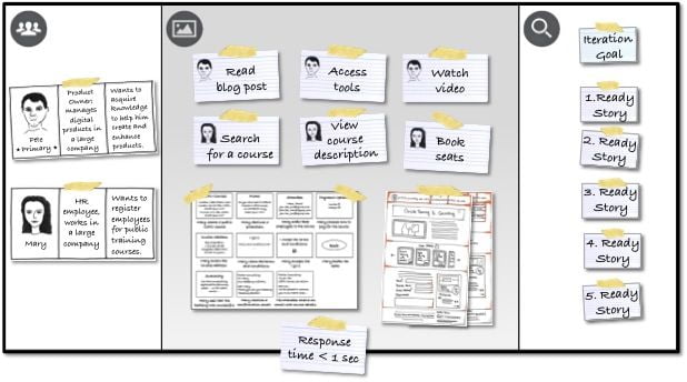
The entire problem was very interesting and pretty challenging. So after weeks of user research doing affinity mapping, user interviews, task flows etc. I came up with a wireframe for the portal. The wireframes were then converted mid-high fidelity prototypes for doing usability testing. After incorporating all the insights from usability testing, I came up with a pretty good UX for the portal which helped the users to achieve their goals with delight. I made sure that they found out everything they are looking for right where they are looking for and the product turned out to be highly usable for both the user personas.

Once I was done with the final UI for the portal, I was presenting it to my clients in their board room which has nice wooden arts carved on to the walls of the room. I was excited about the entire presentation and I was proud of myself being able to achieve great results. The entire presentation went pretty well and I was able to convince the majority of audience that this is the best solution for the e-commerce portal they are looking for. But all of a sudden as I was about to end my presentation with myself on top of cloud nine, a young lady who was VP of their sales and marketing division said

“Ok it works very well and solves the purpose, but we don’t really see a WOW factor here which could amaze our users”

and I was like
silicon-valley OK!

Source: tenor

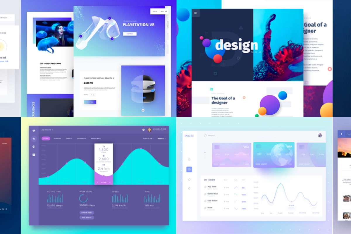
Fortunately, I was ready for this and I always made this my habit to go to such meetings with a backup solution. My backup solution was very contrasting with the solution I proposed and had all the fancy animations, colourful icons and pop ups. I then took this as an opportunity to showcase my other solution. The same marketing lady then said, yeah this is really cool with all the animations and images why not use this solution? Then I showcased my usability testing results for both the solutions and the one with the wow factor confused the majority of the users falling in the farmer persona. Post which, all the members in the meeting agreed to go with the solution I presented first taking some aspects of solution B incorporated in it.

The question which arises here is are businesses, product commissioners aware about how to capture the power of design in creating value for their businesses rather than to make it look ‘beautiful’? It also makes an important point about giving feedback towards a design, feedback should be such that it avoid all the vague terms like ‘WOW’, ‘beautiful’, ‘catchy’, ‘exciting’. Feedback should majorly focus on whether or not the solution solves the problem of the users and how can we improve the solution to give users a seamless experience.

What you can do to make ‘lay-users’ go WOW?

Now, I can assume there would be many designers who would have faced the same situation and end up being frustrated that the viewers just don’t get their design. Now I may not totally agree to the statement, that the guys like CEO or VP of any organisation do not understand what UX design is? (though there may be mismatches about what the goal of design is) We as designers should take this as an opportunity to educate them about the value being delivered by design in a language which they understand and in visuals they like to see. You can do this by:
  1. Stop being a hardcore designer

    stop being a designer

    Source: Pinterest


    Do not use terms like kernel, gutter, typography, iconography, responsive, cognitive while presenting. Try presenting the value being delivered by saying 85% of users were able to successfully complete their goal and up-sell opportunities rose by 20% taking the conversion rate to over 11%. For this, you must need to understand the business by getting to the core of the problem you are trying to solve.

  2. Presenting designs as stories

    present designs as stories

    Source: Romanpichler


    You could really achieve an upper edge, if you could incorporate a real life scenario in your designs and show how the flow of information in your designs help users achieve their goals. For this you can use real data rather than lorem ipsum texts. Start by the problem one of the user is facing and how he uses your solution to successfully achieve his goals.

  3. Focus on UX writing

    ux writing

    Source: UX Planet


    This is still a new field and many biggies like Google, Microsoft have started putting out designations like UX writer. The main role of the UX writer is to churn out proper words from the language of the users so that the users are easily able to understand the information which is being delivered. For eg., a call to action button could have ‘Submit’, ‘Next’, ‘Go to next’ etc as the text. The final text should be supported by some user testing and ethnographic data.

  4. Presenting UI interactions

    user interface interactions and animations

    Source: Galshir


    Seeing the actual animations/interactions instead of static images always gives a clearer picture to the viewers. It helps the designers to rightly present the idea they are trying to deliver. I would say more than 70% of the visual WOW factor could be achieved if all the interactions are rightly placed with every click, hover, swipe or tap. There are many tools which can help in creating some amazing high fidelity interactions like Origami, Principle, Flinto etc.

  5. Creating the actual use environment

    quick prototypes of designs

    Source: Muawwaaz


    It is always advisable to present designs in the devices it is meant for. Like an iOS app can be presented on an iPhone device where the users can actually experience vibrations, swap interactions, sounds and other haptics. Similarly a web design should be presented on a desktop/mac devices. If there are other physical factors like location, temperature or position of the device while using the app, the same can be simulated while presenting the designs. This way the viewers can get into the shoes of the end users who are going to eventually use their product.
The list may even continue longer as there could possibly be many other factors which may contribute in either the functional or the visual WOW factor but it can be surely concluded that:


Conclusion:
“Fancy and WOW interfaces may attract the users at once, but to retain those users it has to be functionally WOW rather than visually WOW”

I hope you enjoyed reading this article. Thanks for your time and feel free to add your comments below and let me know your thoughts about this article.

Disclaimer: This article was originally published on medium and has been published here with the permission of the author.

Author: Kirit Lakhani, UX Lead @ Zycus Inc.

FACEBOOK COMMENTS WILL BE SHOWN ONLY WHEN YOUR SITE IS ONLINE

ux audit facebook comments

Get latest articles in your inbox

Subscribe to our newsletter & we promise we won't spam